(01)
(01)
(01)

Lead Product Designer
Lead Product Designer
Lead Product Designer
Animator
Animator
Animator
8 Weeks
8 Weeks
8 Weeks
HR Tech
HR Tech
HR Tech
B2B
B2B
B2B
UX Research
UX Research
UX Research
The Diversio dashboard is a comprehensive DEI tool and can have a steep learning curve for new users. Working alongside the Product Manager, I was tasked with the creation of an onboarding flow to introduce new users to the dashboard, illuminate the range of tools available, demystify dashboard jargon and reinforce helpful user behaviours.
The Diversio dashboard is a comprehensive DEI tool and can have a steep learning curve for new users. Working alongside the Product Manager, I was tasked with the creation of an onboarding flow to introduce new users to the dashboard, illuminate the range of tools available, demystify dashboard jargon and reinforce helpful user behaviours.
(The Problem)
(The Problem)
The Diversio dashboard is a comprehensive tool for clients — with a steep learning curve.
As Diversio continue to roll out additional product features, the learning curve will only get steeper.
Mixpanel data suggests the Solutions screens of the dashboard are underutilised.
(The Goal)
(The Goal)
To create an onboarding flow to ease users into the dashboard and enable them to begin benefitting from the service from go.
To ensure that users are fully aware of the breadth of features available to them, and how to use them.
View prototype
View prototype
View prototype
1
1
1
Research
Research
Identifying the user's pain points with Design Thinking
To identify dashboard areas needing improvement, we conducted user interviews and consulted the Diversio sales team for feedback.
Users were asked to interpret data by answering key questions, such as:
comparing company inclusivity to industry standards;
differences in executive versus staff perceptions;
and gender-specific sentiments.
If users struggled with these questions, it revealed usability barriers that required attention.
Approaching the project with Design Thinking:
Approaching the project with Design Thinking:

Insights from the user interviews:
Insights from the user interviews:

(01)
(01)
Users asked to give the dashboard a 1-10 usability rating gave an average score of 5/10.
Users asked to give the dashboard a 1-10 usability rating gave an average score of 5/10.
(02)
(02)
"I only use the dashboard quarterly. I can't spend weeks learning to use it."
"I only use the dashboard quarterly. I can't spend weeks learning to use it."
HR professional dashboard user.
(03)
(03)
Users did not understand certain important behaviours.
Users did not understand certain important behaviours.
(04)
(04)
Users were overwhelmed by the amount of data immediately available.
Users were overwhelmed by the amount of data immediately available.
(05)
(05)
Much of the data contains jargon terms that require some level of familiarity to DEI initiatives to understand.
Much of the data contains jargon terms that require some level of familiarity to DEI initiatives to understand.
(06)
(06)
Users were not aware of the purpose of various screens of the dashboard.
Users were not aware of the purpose of various screens of the dashboard.
Key issues and assumptions:
Key issues and assumptions:
(01)
Each page would benefit from a high-level Tour to define the purpose of the page
(02)
Target user would not invest a huge amount of time in learning the platform, so the Tour must be brief
(03)
Solution must also serve the purpose of reinforcing important user behaviours.
(01)
Each page would benefit from a high-level Tour to define the purpose of the page
(02)
Target user would not invest a huge amount of time in learning the platform, so the Tour must be brief
(03)
Solution must also serve the purpose of reinforcing important user behaviours.
(01)
Each page would benefit from a high-level Tour to define the purpose of the page
(02)
Target user would not invest a huge amount of time in learning the platform, so the Tour must be brief
(03)
Solution must also serve the purpose of reinforcing important user behaviours.
2
2
2
Design
Design
Defining the scope of the Onboarding Flow
- a brief, compulsory tour with engaging animations;
- an optional checklist for deeper insights.
- a brief, compulsory tour with engaging animations;
- an optional checklist for deeper insights.
Onboarding user flow:
Onboarding user flow:
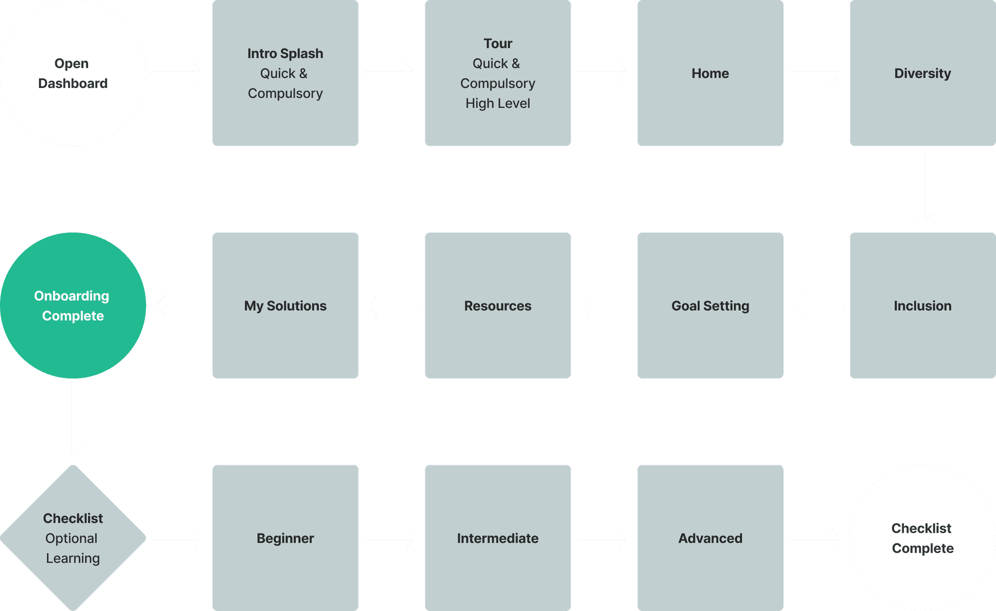

Identifying key areas of the dashboard that required onboarding support:


From Tooltips to Tour modals — all the same component, personalised with Boolean properties.


3
3
3
Animation
Animation
Defining the scope of the animated Tour
To keep the number of steps and each animation as short as possible, I went through each screen and identified only the main actions that we wanted to reinforce for the user.
The animations were made in Jitter to ensure they could be built directly from Figma components.
To keep the number of steps and each animation as short as possible, I went through each screen and identified only the main actions that we wanted to reinforce for the user.
The animations were made in Jitter to ensure they could be built directly from Figma components.
Each animation seeks to reinforce the primary behaviour for each screen:
Each animation seeks to reinforce the primary behaviour for each screen:
Homepage
Check the Homepage for a quick overview of your key analytics!
Back
1 of 6 | Next
Homepage
Check the Homepage for a quick overview of your key analytics!
Back
1 of 6 | Next
3
The Final Prototype
The Final Prototype
A streamlined onboarding experience
A streamlined onboarding experience
The task of onboarding for a product with a steep learning curve has been distilled into 6 short step that focuses on the main user behaviour required for each page, so that users can hit the Dashboard running. Then, should they wish, a more granular Checklist can be completed at their own pace where we lead them through answering the most common DEI questions.
The task of onboarding for a product with a steep learning curve has been distilled into 6 short step that focuses on the main user behaviour required for each page, so that users can hit the Dashboard running. Then, should they wish, a more granular Checklist can be completed at their own pace where we lead them through answering the most common DEI questions.
4
4
4
Evaluation
Evaluation
How do we measure the results of Onboarding?
How do we measure the results of Onboarding?
We took a multi-faceted approach to measuring onboarding, monitoring Mixpanel data for traffic across the dashboard and also conducting a survey to assess user responses to the improvements.
We took a multi-faceted approach to measuring onboarding, monitoring Mixpanel data for traffic across the dashboard and also conducting a survey to assess user responses to the improvements.
Onboarding feedback through survey and Mixpanel data:
Onboarding feedback through survey and Mixpanel data:
(01)
(01)
Users asked to give the dashboard a 1-10 usability rating gave an average score of 8/10.
Users asked to give the dashboard a 1-10 usability rating gave an average score of 8/10.
(01)
(01)
20% increase in clicks through to "Resources" screen.
20% increase in clicks through to "Resources" screen.
(01)
(01)
12% increase in clicks through to "My Solutions" screen.
12% increase in clicks through to "My Solutions" screen.
(02)
(02)
14% increase in resources being saved to "My Solutions" screen.
14% increase in resources being saved to "My Solutions" screen.
5
5
5
Learning Outcomes
Learning Outcomes
This project reinforced the importance of thorough user research, and keeping the user in mind at all parts of the design journey. Additionally, iterating based on direct user feedback helped shape a more responsive and user-centric experience. The project highlighted the need to maintain a balance between simplicity / number of steps, and thoroughness, ensuring that the experience keeps cognitive load to a minimum wherever it can, whilst also achieving its primary goals.
This project reinforced the importance of thorough user research, and keeping the user in mind at all parts of the design journey. Additionally, iterating based on direct user feedback helped shape a more responsive and user-centric experience. The project highlighted the need to maintain a balance between simplicity / number of steps, and thoroughness, ensuring that the experience keeps cognitive load to a minimum wherever it can, whilst also achieving its primary goals.